So, although I have blog topics lining up, the emptiness makes it difficult to write much that's insightful.
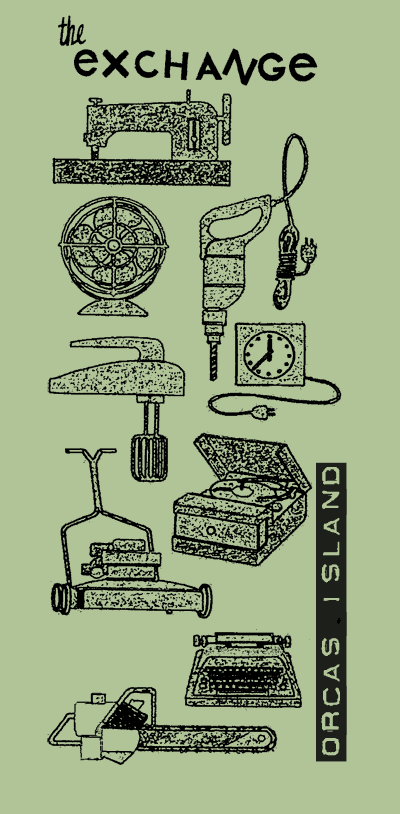
However, this morning I had a meeting with local T-shirt magnate, Andrew Y. and finalized both the design and the amount to make a run of T-shirts for The Exchange. I'm pleased with this, because I came up with the design. Some of you know that I struggle with viewing myself as an artist because I'm a terrible draw-er. I did, in fact, draw a design that was approved by committee. However, my priority in design was to make a T-shirt with a logo that hipsters in Chicago and Seattle would wear even if they had no idea what The Exchange was. I also wanted to incorporate the letters on the side of the main building that identify The Exchange. My hand-drawn image looked to childish in my head to be cool. So, I discarded it and started looking for retro images in the books that come in by the truckload to find something that was appropriate, since images from the Golden Age of American Marketing are so appealing right now. I had tinkered with Hawaiian imagery but got booed down for that. And voila! In a Golden Book of Knowledge from 1962 on energy, I found the perfect images of the classic things that come into The Exchange. The only thing missing is clothing but we don't like to play that up; it just leads to more boxes of garbage clothes, you know, drowned in cat piss, moth eaten, baby spit-up-upon if people think we're desperate for an object. As it is, there has been concern expressed that there is a picture of a lawn mower, which is a problem item for us. I reassure them that the community won't take the T-shirt for hard and fast policy. Sometimes a design is just a design.
So, this is it, roughly. I'm not sure why this version has a green background and we decided to do the image in white, with the letters of The Exchange and the box around Orcas Island done in red. We tried it on a variety of backgrounds and it looks good.


No comments:
Post a Comment